

Start with the character of the space
Choosing artwork is not simply a matter of finding an image that matches the sofa. A successful selection considers the character of the room, its architecture, the people who use it and the atmosphere the designer wants to create. Photography can introduce colour, texture, perspective and a connection to the natural world, while giving a room an individual point of view.
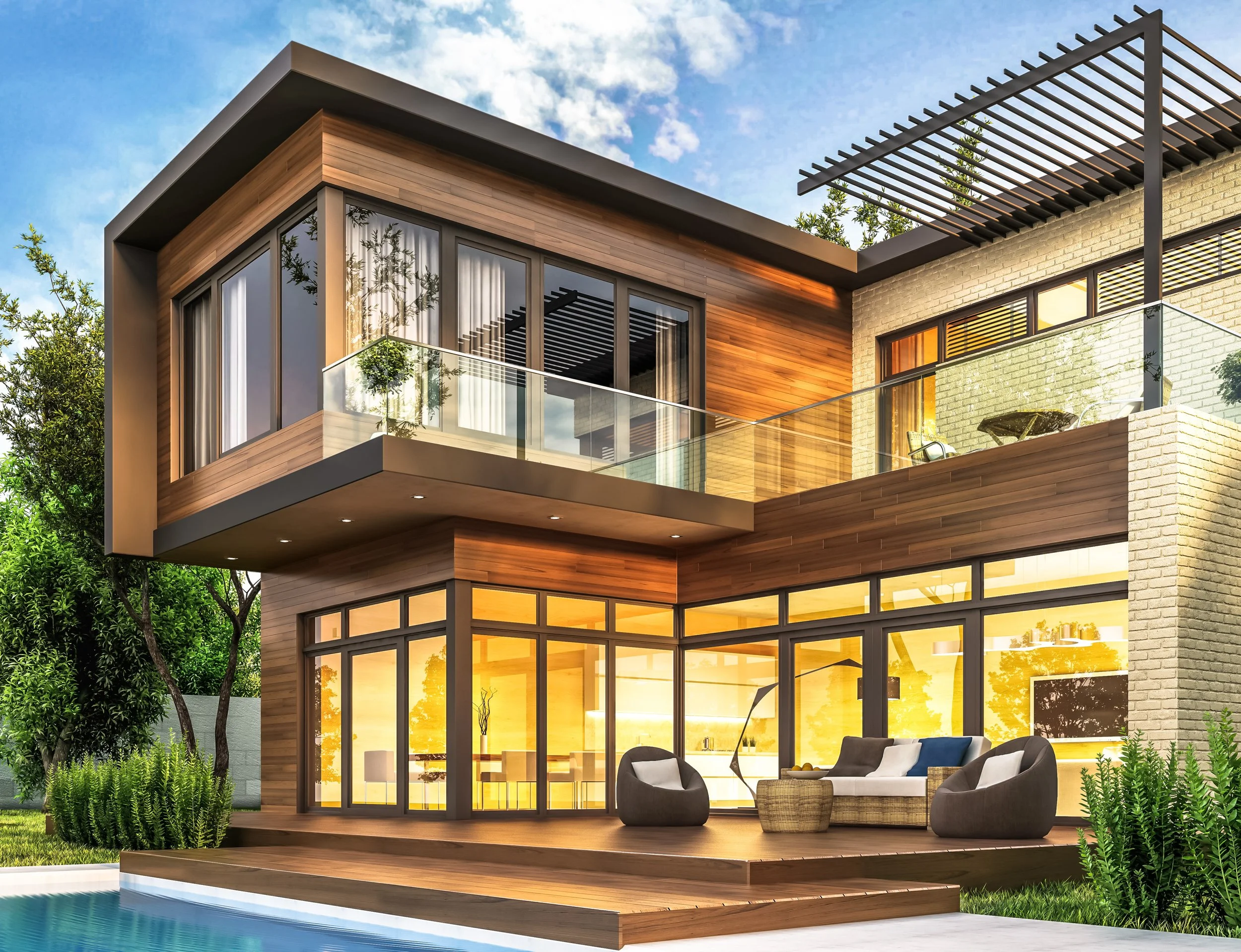
Interior Design
Choosing the right artwork
Begin by identifying the design direction. A restrained contemporary interior may benefit from a photograph with a simple composition, generous negative space and a limited palette. A coastal scheme might welcome soft ocean tones, warm sand colours or a sunrise with subtle pinks and blues. In a more expressive interior, a dramatic aerial image or richly coloured landscape can provide a confident focal point.
Consider colour, tone and contrast
Look beyond the dominant colour in an image. Consider its undertones, contrast, saturation and tonal range. A photograph with muted greens and warm neutrals may sit comfortably alongside timber, linen and stone. Cooler blues can complement pale interiors, while a darker image may create depth against a light wall.
Artwork does not need to repeat every colour already present in a room. It can introduce a considered accent or provide a visual link between several materials. The key is to make the relationship intentional. Compare the image with fabric, flooring, paint and finish samples in the lighting conditions in which the artwork will be viewed.
Get the scale right
Scale has a substantial effect on how artwork is experienced. A small print on a large wall can feel disconnected, while an oversized work may overwhelm a compact room. Consider the wall as a whole and the furniture below it. Above a sofa, bed or console, the artwork should relate to the width and visual weight of the furniture rather than being selected in isolation.
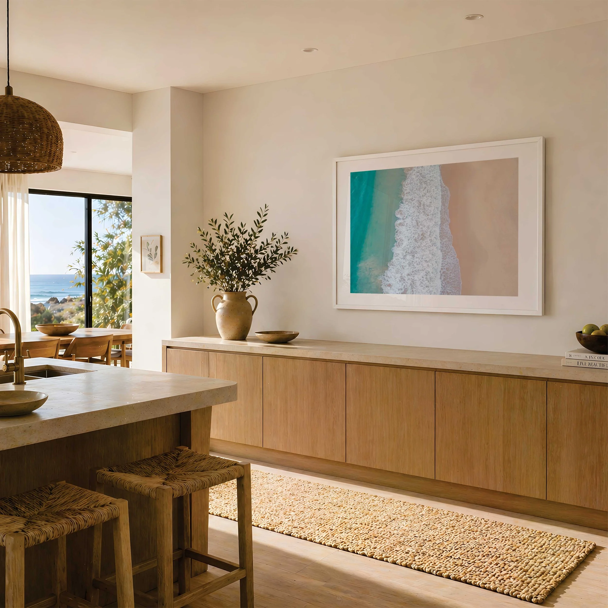
Contemporary Photographic Artwork
Creates a focal point and gives a room a distinctive sense of place.
“Coastal Aerial” print
A single large photograph can create a calm, resolved focal point. A pair or group of prints can be useful when a wall is wide, when a design needs rhythm, or when the images form a coherent series. Panoramic photographs are particularly suited to long horizontal spaces, including walls above sofas, dining settings and reception counters.
Match the presentation to the design
The image is only one part of the finished artwork. Paper surface, mat board, frame profile, frame colour and glazing all influence its appearance. A fine art paper print with a simple frame and generous white mat can feel quiet and considered. A narrow frame may suit a contemporary scheme, while natural timber can connect an image to warmer materials.
For Bronwyn Bell Photography, current print options include smooth cotton rag, lustre and glossy papers, printed using Epson pigment inks. These finishes have different surface qualities and should be considered alongside the photograph and the room. Other formats, such as canvas or acrylic presentations, can also be discussed as distinct options in the wider market, but should not be assumed to be part of a particular supplier's range.
Think about the room's purpose
A bedroom may call for imagery that feels restful and does not create excessive visual activity. A reception area may benefit from a stronger image that gives visitors an immediate impression of the organisation. A dining room can accommodate a more conversational or expressive photograph, while a corridor may need a sequence that guides the eye through the space.
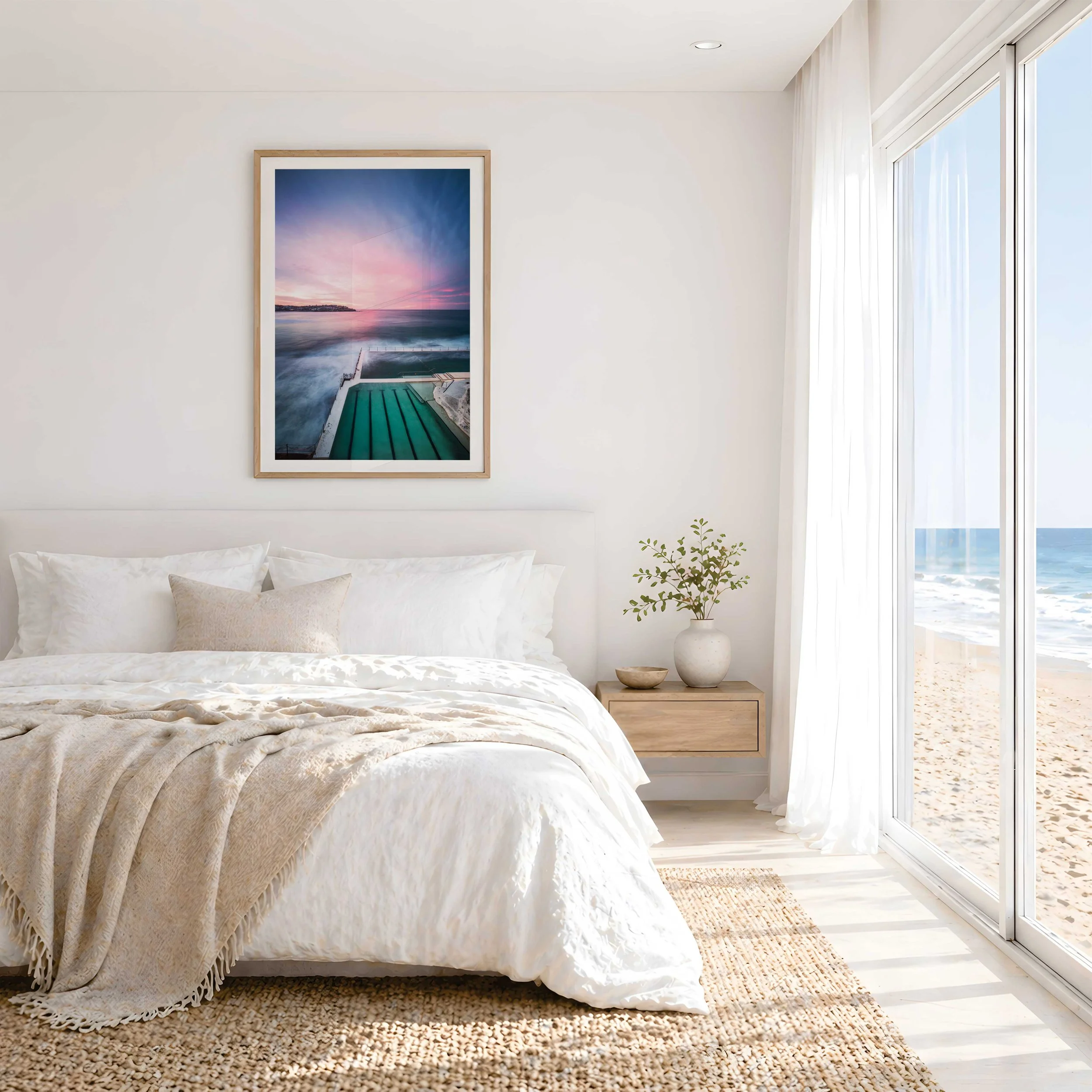
Coastal Bedroom
A bedroom benefits from a calm photographic artwork.
“Bondi Icebergs” print
Ask how the room will be used, who will see the artwork and what impression it should leave. This moves the decision beyond decoration and makes the artwork part of the design brief.
A considered selection process
Before specifying a print, review the image at the intended orientation and aspect ratio, confirm the finished dimensions, and check how the frame and mat affect the overall footprint. Where possible, use a room mockup to help clients understand scale and placement. A digital mockup is a useful visual aid, although it cannot fully reproduce the colour, texture or reflective qualities of a physical print.
The strongest selections balance image, colour, scale, presentation and context. When these elements work together, photographic artwork becomes an integral part of the interior rather than an afterthought.
Interior designers and decorators are welcome to enquire about artwork options, print sizes and trade pricing through the Design Trade Enquiries page.
